The Project Available Here
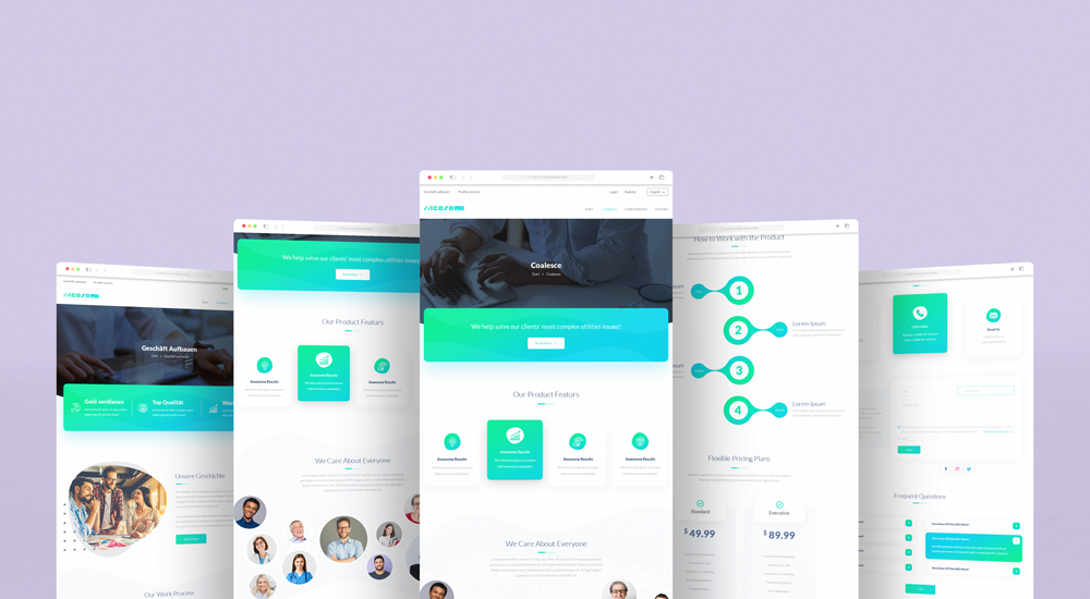
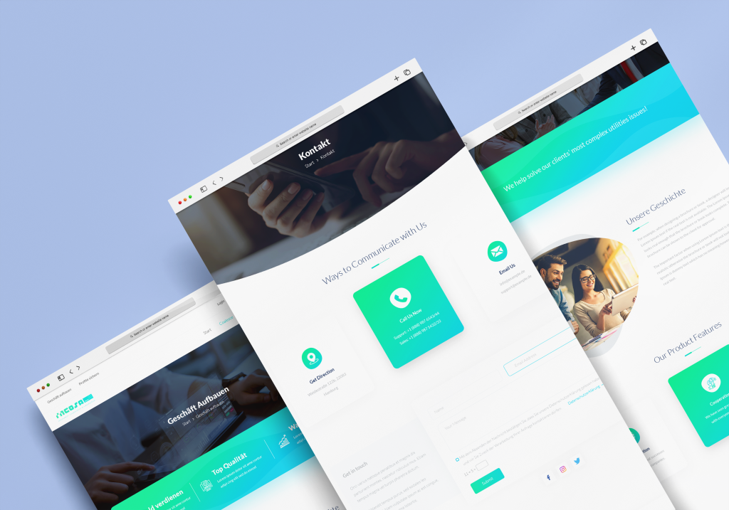
As the FX Trading Germany website’s UI designer, I created visually appealing and user-friendly interfaces that fit the brand and target demographic. The programming team and UI designer worked together to integrate the website’s features. I also conducted user research and received feedback to improve UI design and user pleasure. I improved website navigation and style for user experience and accessibility.
Since the shareholders of this project were a German group, German was chosen as the primary and official language, and as a result, the website is in German. The project documentation has also been prepared in German.
The colors chosen for the brand are colors that evoke a sense of security, vitality, and investment, which is why green combined with blue has been suggested, and the investor has agreed. The designed logo, as per the client’s choice, is a typographic logo with a symbol of the world included to represent the global nature of the project.

Goals of UI Design :
Trading Process Simplified The primary objective of the website’s design was to simplify the trading process for consumers. Ensuring that users could readily access and follow forex trading strategies and charts was intended to increase user satisfaction and encourage repeat website usage.

I created an engaging user experience, which encouraged users to investigate the website’s content and services in greater depth. This objective was accomplished with the assistance of interactive elements, user-friendly charts, and an aesthetically pleasing design.
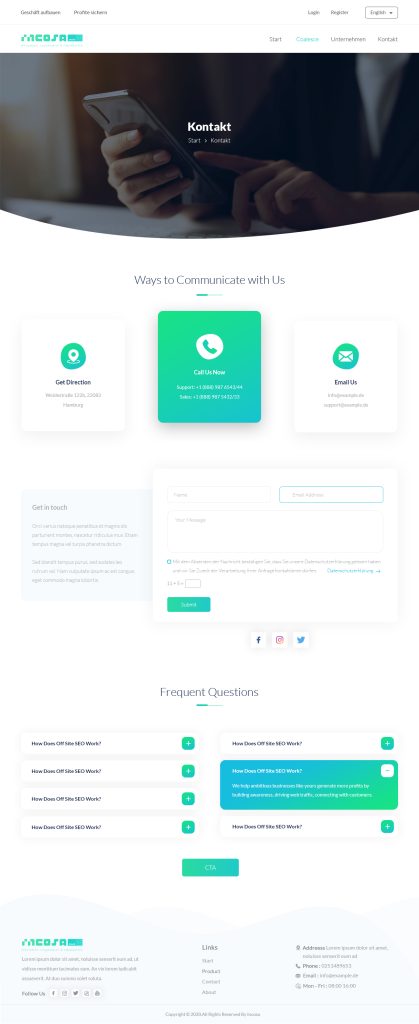
For a clearer view, I have uploaded the original shot; please click on the image and then return to the website.
Streamlined Navigation: The design prioritised streamlining website navigation so that users could swiftly and easily locate the information they required. Clear categorization and intuitive menu structures were implemented in order to improve the user experience and decrease redirect rates.
For a clearer view, I have uploaded the original shot; please click on the image and then return to the website.
Another essential objective was to ensure a consistent user experience across multiple devices and screen sizes. The design of the website has been optimised for responsiveness, allowing users to access forex trading strategies and charts from any device.

By providing accurate and dependable information about forex trading strategies and indicators, the UI design aimed to establish trust and credibility with users. A transparent and informative method of content presentation contributed to the accomplishment of this objective.
For a clearer view, I have uploaded the original shot; please click on the image and then return to the website.
By achieving these UI design objectives, the forex trading website aimed to become a trustworthy and user-friendly resource for users seeking information about forex trading strategies and charts, ultimately resulting in increased user engagement and profitable forex trading experiences for customers.


