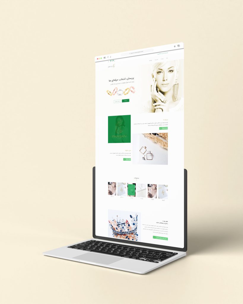
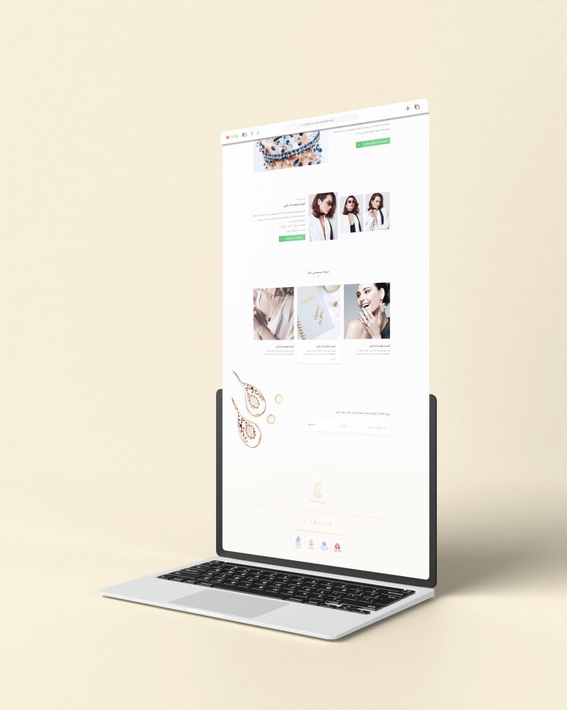
Parisan, nestled in Mashhad, embarked on a journey to shine its golden glow beyond its store’s walls. Specializing in handmade bracelets, rings, and necklaces, Parisan sought a robust online presence that would echo its craftsmanship and elegance.
Harnessing the potential of WordPress combined with WooCommerce’s e-commerce prowess, a digital storefront was designed. This platform was meticulously sculpted to reflect Parisan’s unique offerings, providing a seamless and luxurious shopping experience to customers near and far.
The Project Available Here

Project Overview:
The project entailed designing a comprehensive marketplace platform for selling jewellery and handmade accessories such as bracelets, rings, and necklaces. The marketplace aimed to leverage the capabilities of WooCommerce and WordPress to create a seamless e-commerce experience. Additionally, the platform was to incorporate a blog for daily posts to engage customers and an Instagram medium for advertising gold items and other featured products. The primary objectives were to create an intuitive, visually appealing, and user-friendly platform that could cater to both sellers and buyers, while also integrating effective marketing tools to drive traffic and sales.
The project’s scope included the development of a responsive website, ensuring smooth navigation and a pleasant user experience across different devices. The design process encompassed user research, information architecture, wireframing, UI design, and usability testing. The ultimate goal was to enhance the shopping experience for users and provide sellers with a robust platform to showcase and sell their products.

Problems :
The existing platforms lacked the necessary features and user-centric design to cater to the unique needs of a jewellery marketplace. Key issues and challenges included:
- Inadequate product categorization leading to difficulty in finding specific items.
- Lack of visual appeal and detailed product descriptions affecting purchase decisions.
- Poor integration with social media platforms for marketing and engagement.
- Limited customization options for sellers to showcase their products effectively.
- Inefficient checkout process causing cart abandonment.
- Absence of a dedicated blog section to engage customers with content.
- Difficulty in managing inventory and orders for multiple sellers.
- Poor mobile responsiveness affecting the user experience on smartphones and tablets.
- Lack of user reviews and ratings, reducing buyer confidence.
- Insufficient SEO optimization, impacting visibility in search engines.

Solutions:
To address these challenges, several solutions were proposed and implemented:
Enhanced Product Categorization: Implementing a detailed and intuitive categorization system for easy navigation and product discovery.
Visual and Informative Listings: Using high-quality images, detailed descriptions, and videos for each product to enhance the visual appeal and provide comprehensive information.
Social Media Integration: Seamless integration with Instagram and other social media platforms for advertising and engagement.
Customizable Seller Pages: Allowing sellers to create personalized storefronts with customizable layouts and features.
Streamlined Checkout Process: Simplifying the checkout process with fewer steps and multiple payment options to reduce cart abandonment.
Dedicated Blog Section: Creating a blog for daily posts to engage customers with relevant content and improve SEO.
Efficient Inventory Management: Implementing tools for sellers to manage their inventory and orders efficiently.
Responsive Design: Ensuring the platform is fully responsive and provides a seamless experience across all devices.
User Reviews and Ratings: Adding a review and rating system to build trust and credibility among buyers.
SEO Optimization: Enhancing the platform’s SEO to improve visibility and attract organic traffic.
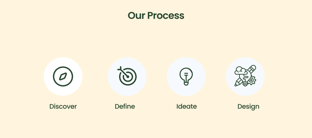
For our project, this question was the key to our research:
- Who are the target users? (demographics, jewelry buying habits/experience)
- What motivates them to purchase jewelry online?
- How do they currently search for and purchase jewelry? What pain points exist?
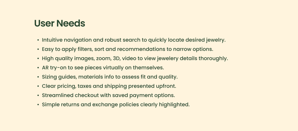
- How do they want to search, browse and purchase jewelry on the website/app?
- What jewelry selections and product information do they require?
- How do they make payments? What payment options do they prefer?
- How do they want delivery, returns, and exchanges handled?
The information architecture was designed to ensure easy navigation and accessibility:
- Homepage: Featuring top products, categories, and promotional banners.
- Product Categories: Divided into specific sections like bracelets, rings, necklaces, etc.
- Product Pages: Detailed pages with images, descriptions, and related products.
- Blog: Regularly daily update with posts on trends, tips.
- Cart and Checkout: Simplified process with clear steps.
- Customer Support: Easy access to FAQs, contact forms, and live chat with WhatsApp .
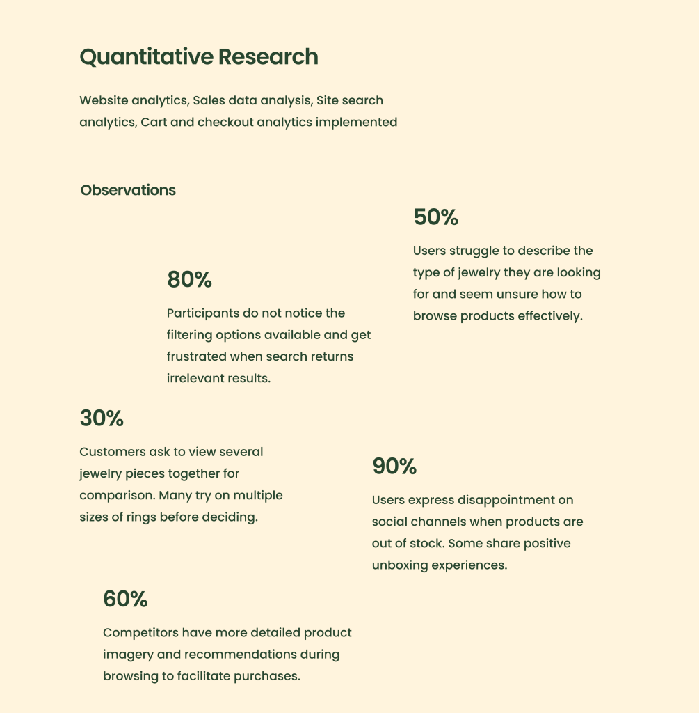
Define Problems:
- Finding relevant jewelry products is difficult and slow on the current site.
- The checkout process has too many steps and is confusing, leading to high abandonment.
- Specific jewelry categories, like rings and bracelets, take longer to browse than necklaces or earrings.
- On mobile, search and filters are ineffective (also sorting), and navigation needs improvement.
- Product detail pages lack sufficient images, videos and size guides to evaluate them effectively.
3. Ideation:
For this process, brainstorm:
- Implement infinite scrolling and “recommended for you” sections for easier product discovery
- Offer guest checkout and express checkout options to reduce steps
- Use progressive disclosure to only show necessary checkout fields first
- Allow saving payment info for faster future checkouts
- Categorize products better based on user mental models
- Improve filter and sort options for faster browsing
- Enhanced search with autocorrect and suggestions
- Virtual try-on for rings, earrings, necklaces via AR
- Image zoom, 360 spin, video for evaluating products
- Size guide, material info, styling tips for product pages
- Predictive shipping and taxes before checkout
Sketching:
- Mobile nav drawer with categories, account, cart
- Minimal home page with top categories, promotions, arrivals
- Product listing pages with clean grid or list layout
- Product detail page with large image carousel
- Smooth step-by-step guided checkout flow
4. Design:
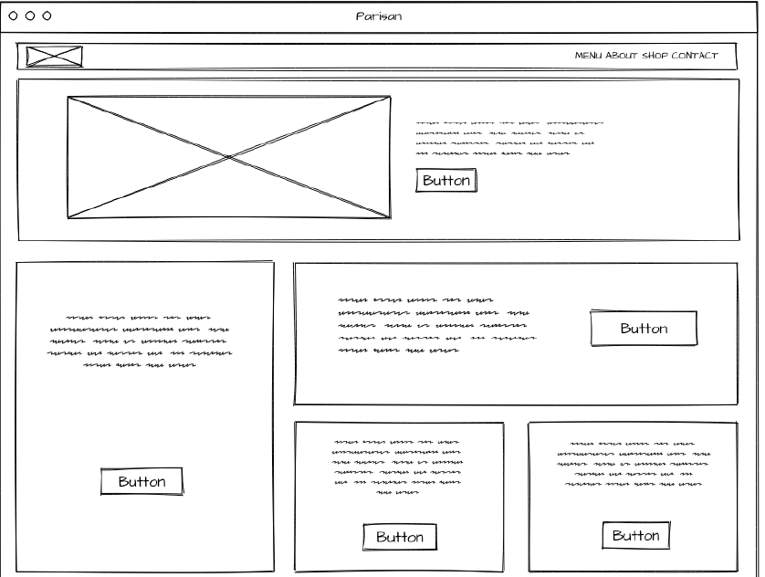
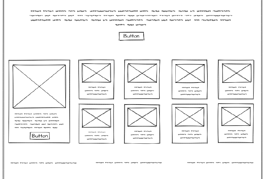
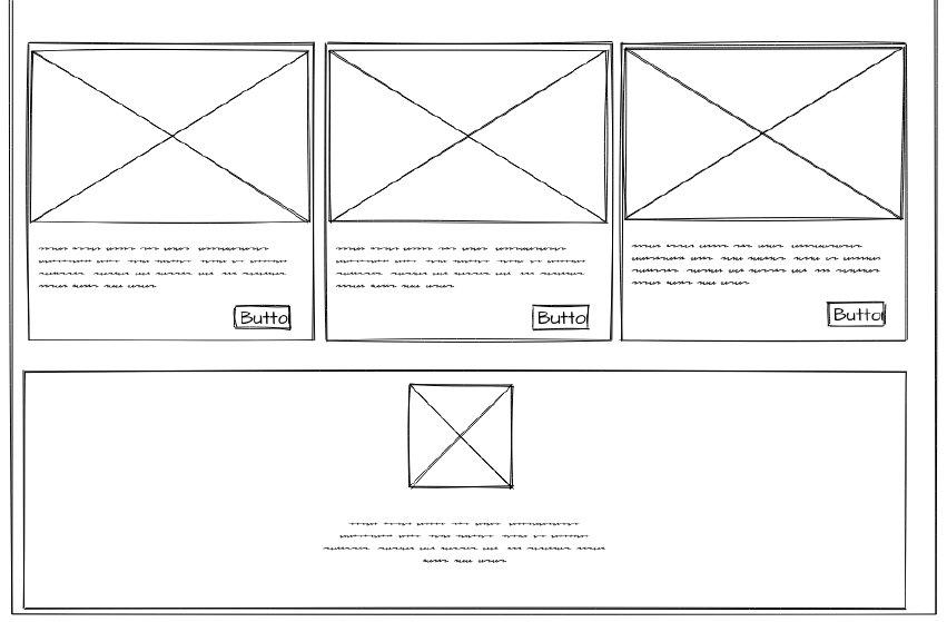
- Wireframing: Develop basic UI structures.
- Prototyping: Create interactive models of the final product.
5. User Testing:
- Testing Prototypes: Implement user testing sessions with prototypes to gather feedback.
- Analyse Feedback: Understand user reactions and areas needing improvement.
6. Features and Funtionalities
Find relevant products easily:
- Intelligent site search with suggestions, spelling corrections, and synonyms (with Searchanise WooCommerce plugin)
- Faceted navigation and filtering by category, style, metal, stone, price range
- Personalized recommendations based on purchase history and browsing
- Visual guides to exploring top jewelry styles and trends
Visualize products effectively:
- High resolution 3D model and zoom capability for detail close-ups(base on Jewellery 3d Designs)
- Product rotation, alternate views and videos for full perspective
- Augmented reality virtual try-on of rings, earrings, necklaces
- Detailed product descriptions, specs, materials, care instructions
- Size guides with ruler for reference and measuring own jewelry
Seamless purchase process:
- One page guided checkout with automatic form-filling
- Guest checkout and express checkout for faster purchases
- Multiple payment methods including installments, Apple/Google Pay
- Real-time shipping rates and delivery date estimates
- Saved payment methods and shipping for repeat purchases
- easy self-service returns and exchanges
7. Launch and Monitor
Value of the Project
The marketplace provides significant value to both users and the business:
- For Users:
- Easy navigation and product discovery.
- Rich and informative product listings.
- Engaging content through the blog.
- Seamless shopping experience across devices.
- Trust-building through user reviews.
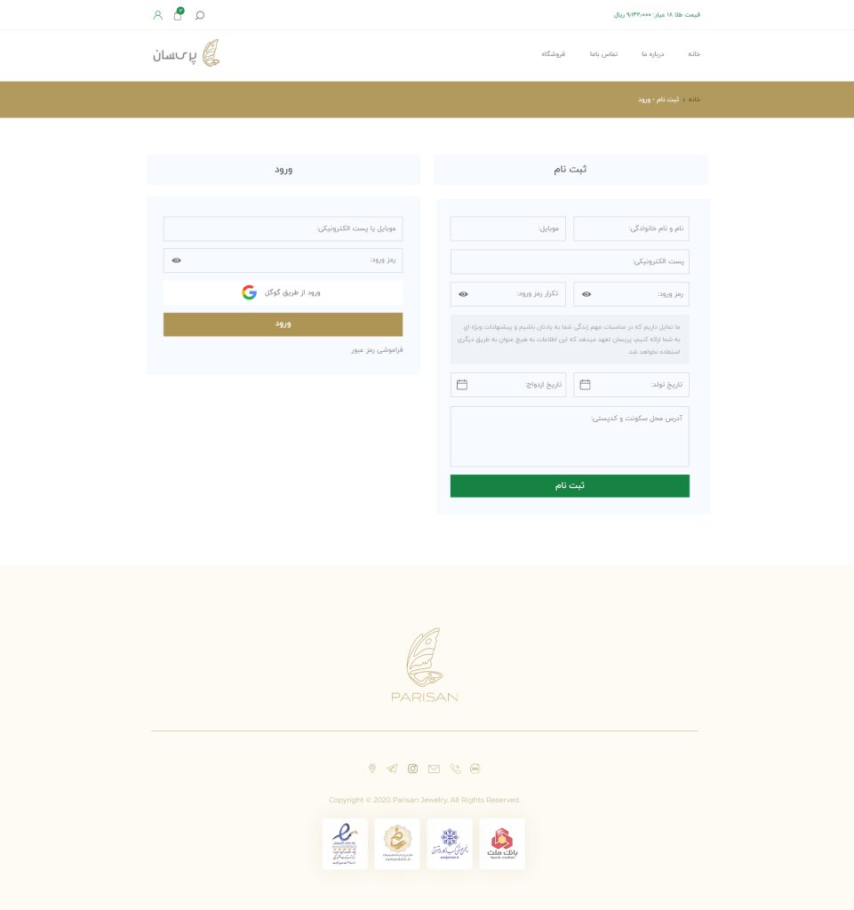
Impressive Growth: What started as a blank digital canvas soon turned into a flourishing online venture. Within a span of just six months, Parisan witnessed a monumental rise in its online revenue, securing an impressive £2000 monthly – a testament to the amalgamation of strategic marketing, captivating design, and an unmatched product offering.
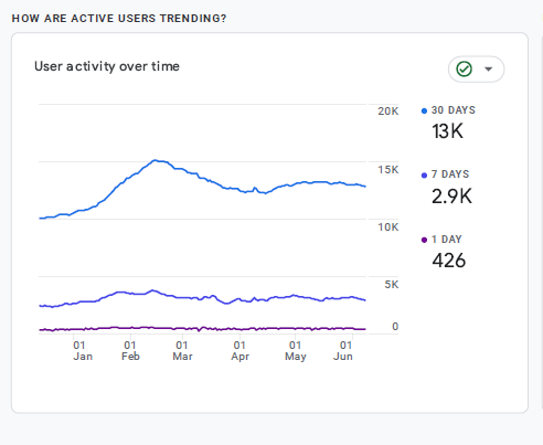
Throughout my collaboration with those teams and stakeholders, their statistics were based on Google Analytics:

iPhone application design:
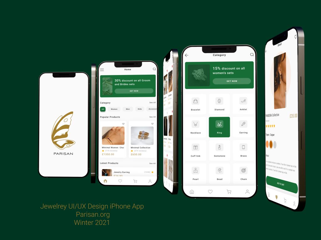
The user interface design focused on creating an aesthetically pleasing and functional experience. The design elements included:
- Clean and Modern Layouts: Using a minimalist design approach to keep the interface uncluttered and easy to navigate.
- High-Quality Visuals: Incorporating professional images and videos for product listings.
- Consistent Branding: Ensuring that all elements align with the brand’s visual identity.
- User-Friendly Navigation: Implementing intuitive navigation menus and search functionality.
- Responsive Design: Ensuring the website looks and functions well on all devices.
- Engaging Content: Using attractive typography and layouts for blog posts and product descriptions.
Conclusion: The Parisan project of 2022 showcased a holistic approach to digital retailing – starting from establishing a brand’s online footprint, weaving through the realms of design and UX, and culminating in a successful digital marketing strategy. It’s a testament to what can be achieved when craftsmanship meets strategic digital implementation.
If you would like, you can put your comments for me on my Dribbble’s post.